


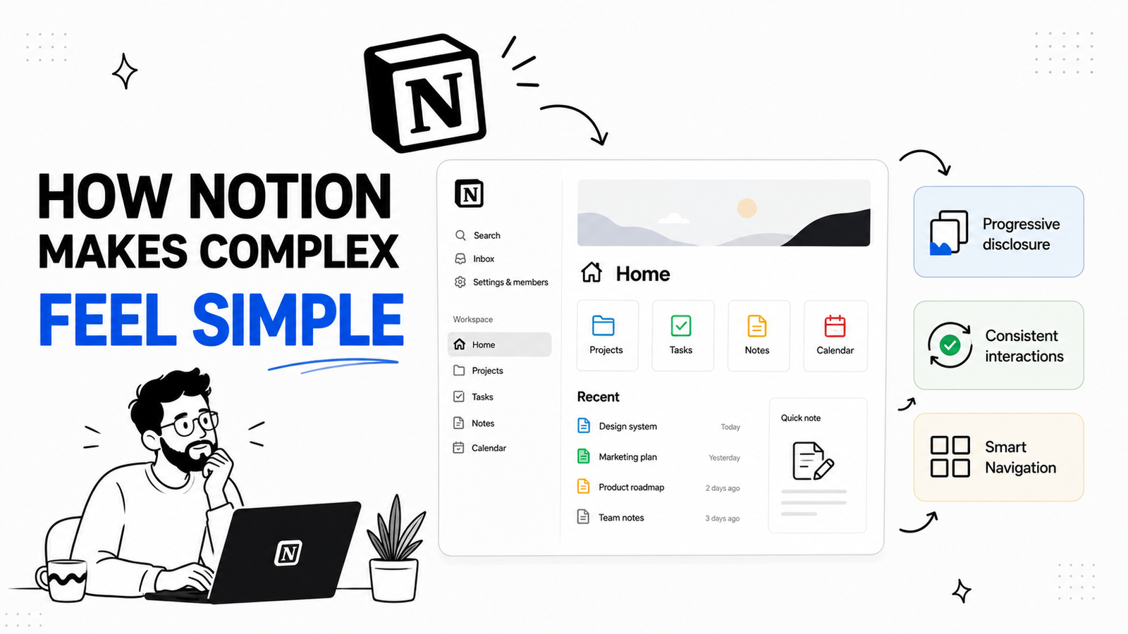
Today we are going to study notion meaning we are going to understand how notion a really complex web-app with multiple features and options removed all most all the friction in the learning process of their UX.
Like if you’re starting on notion for the very first time you can get used to their UI very fast as if it’s magic but it’s not l
today we will break down the type of design patterns they chose that enabled them to do it. So you can use this type of designs on your saas to make grow your userbase
Before going to the actual video let me ask a question what makes most SAAS complex UI/UX less desirable? pause the video think about it and share your thoughts
the mistake most founders make is that they Either try to be too simple, which frustrates power users. Or they show every feature at once, which overwhelms the new user.
Notion solves this by giving users flexible building blocks instead of forcing them into one rigid workflow. It lets users start simple and gradually build structure.”
Now without wasting any time let’s dive into the design patterns of notion
Pattern 1: Notion Respects Existing Mental Models
People often learns new software faster if it behaves like something they already know
This is based on the UX principle often called Jakob’s Law:
Users spend most of their time on other products, so they expect your product to work like the ones they already know.
When someone first opens notion they can sense many familiarizes because it reminds the user of the tolls they had already used for example:
tables feels like spreadsheet , pages and folders feel like file system, search and shortcuts feels like command palettes and i can keep going but that will make this video way too long
As a result the user doesn’t have to learn everything from the scratch they already understand
highlighting text to format it, typing into cells, opening folder etc.
so don’t force users into a brand new interaction model unless it’s absolutely necessary
ask yourselves these questions before you finalize your decisions
- What tool does this feature remind the user of?
- Is there a familiar pattern we can reuse?
- Are we making users learn a new behavior when an old one would work better?
Pattern 2: Block-Based Editing
Notion treats everything as a block and it doesn’t matter what’s in that block it will treat all the block in a similar manner.
what i am trying to say is notion creates a unifying system across all the different type of block the block can be a text, a heading, an image, a database
it won’t matter in order to edit it or move or basically anything you want to do with it all you need to do is you have go to the 6 dots and you will get all the necessary options
This reduces cognitive load user doesn’t need to know different interaction for every content type. since all interactions are consistent, it creates muscle memory.
which makes the user more likely to continue using your app
In short If your product has many widgets, modules, or components, try to unify their behavior.
Ask yourself
- Do all items have a consistent interactions
- Are users forced to learn different interactions for similar actions?
- Can we create one reusable interaction model for the whole product?
Pattern 3: Progressive Disclosure
Progressive disclosure means revealing the user what they need, at the exact moment when they need it
Many founders or developers makes this mistake, if they build a complex but really helpful feature, they have the tendency to showcase it as soon as possible.
And that’s the problem, although the feature is helpful, but trying to force it in front, can over complicate things for new users.
On the other if you look at notion it’s interface starts in a very calm manner for example
- Formatting options appear when you highlight text
- Block actions appear when you hover over a block
- Database properties expand when needed
This creates a “low floor, high ceiling” experience:
- Easy to start
- Powerful once learned
And that’s the experience you want on your customer
To implement this properly on your SaaS you should ask
- Are we showing every setting on the first screen?
- Can we hide advanced options until the user needs them?
- Can we reveal tools only when the user selects the relevant object?
- Are we forcing users to make decisions too early?
Pattern 4: The Slash Command
If you have used notion you probably know much of a help “ / “ command of notion can be it literally boost productivity by several folds.
it lets users insert blocks, search actions, and create content without navigating through multiple menus.
Where in many apps users have to go through several commands to create a table like “Insert > Table > 3x3” here users can simply type “/table” and then press enter
It reduces the need to memorize where features are located. Users can search for what they need in context.
This is especially helpful for power users, but it is still approachable for beginners.
Your takeaways here should be:
- Can users perform common actions without leaving their current context?
- Can we add a command palette or shortcut system?
- Can we support both mouse-based navigation and keyboard-based shortcuts?
Pattern 5: Information Architecture Makes Structure Feel Natural
Notion makes complex information feel like a physical space than rather than a database
it accomplishes this by letting it’s user create pages inside pages, organizing with a sidebar, and navigate using breadcrumbs.
this makes all the difference in terms of how structured and understandable your information is for example i can create a page called Project and inside of that i can create more pages labeling different type of project
This makes it easier to learn because we humans are good at remembering locations, we understand ideas like
- “It’s inside the Marketing folder.”
- “It’s under the Q3 Roadmap page.”
- “It’s in the team workspace.”
Your takeaways from these should be:
- Can users understand where they are in the product?
- Do they know how to go back?
- Is the hierarchy clear?
- Are we forcing users to create too much structure before they see value?
Problem phase:
Now notion isn’t all sunshine and rainbows many of it’s attempt to making the app simpler come with their own problems.
it isn’t right for me to just tell you it’s good side so now i will give you the bad sides of notion so you can properly decide how to design your SaaS.
Power features can be hard to discover
Previously i have told you notion hides complexity which is a good option but it can lead to some user never finding advanced capabilities which they would appreciate
In order to solve this you can use progressive discloser but it must be paired with proper education you can use template, tooltips, guided onboarding or sample data whichever fits your app the most
Desktop patterns do not always translate to mobile
While notions desktop app is top-notch same can’t be said for it’s mobile app because it relies heavily on
- Hover states
- Precision dragging
- Keyboard shortcuts
- Large screen real estate
which as you can understand can’t be very helpful for a mobile application
If you copy Notion’s desktop patterns, make sure your agency knows how to adapt them for mobile.
For example:
- Hover actions may need to become long-press actions
- Slash commands may need a visible block menu
- Drag-and-drop may need clearer touch targets
The "Fake Spreadsheet"
You may have noticed when Notion displays data in a "Table View," it looks exactly like Excel. Because of this visual similarity, users instantly apply a "Spreadsheet Mental Model" to it.
They expect to highlight 50 cells, drag a formula down, do complex pivot tables, or bulk-edit properties with a keyboard. and that’s where the problem lies.
Because Notion is not a spreadsheet. It is a relational database where every single row is actually a full document page
I am not diving too much into the problems notions have and how you might improve on it because that would make the video much longer than i want it to be also it’s not the main topic of this video.
So If you want us me to make a video highlighting what are the problems of notion UX design pattern or if you want to see this kind of UX teardown video on any other app let’s know in the comment section

Tahmied Hossain
AuthorFull stack developer, Tech Enthusiast.